
Wizardly provides access to your brand’s color palette, organized into three categories:
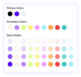
- Primary Colors:
Core brand colors used for main text, backgrounds, and key elements.
- Secondary Colors:
Supporting colors that complement the primary palette.
- Shades:
Lighter or darker variations of the primary and secondary colors, ideal for hierarchy, highlights, or subtle accents.
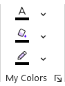
Font Color:
Choose a font color from your brand’s palette to apply to selected text.
Shape Fill:
Choose a fill color for shapes or elements, ensuring visual consistency across slides.
Shape Outline:
Choose an outline color from your brand’s palette to define borders around shapes.